This project was created as coursework for Intermediate Typography in SAIC's Visual Communication Design department, instructed by designer Robert Petrick.
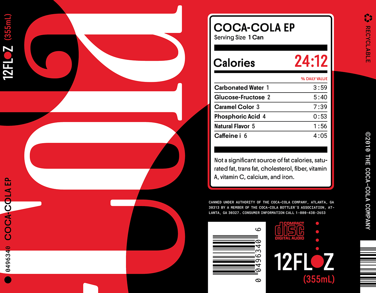
"12FLOZ (355mL)" was created in response to a relatively short assignment from Intermediate Typography that involved the combination of unrelated language and context to form new meaning. In my case, language from soda cans combined with Olympic track and field times related to release dates of the respective brands was used in the context of album artwork.
For example, 12FLOZ was a unifying element of all three cans I chose (being the standard volume of canned beverages) so it became the name of a hypothetical band which I was designing for. The context was determined by a group of myself and three classmates, of which I was the "representative".

After the first week of work I effectively restarted the project from scratch. My initial efforts to integrate images I had generated with the assistance of artificial intelligence were met with a gentle reminder that the project should focus on typography — as indicated by the name of the course. Additionally, the language selected by members of my group (two of whom were working with copy from pharmaceutical labels) inspired me to pick something more challenging than the chapters of graphic novels I originally considered.
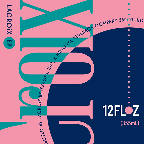
So I looked at the half-empty LaCroix can on my desk and decided its textual content would be most illogical in relation to album artwork. It was at this point I struggled significantly after realizing how heavily CD covers rely on graphics and images over text — not to mention I didn't have any substantial amount of copy to work with from soda cans. My immediate reaction was to offset the restriction on graphics with intricate display type, to which end I wasn't able to develop anything satisfactory.
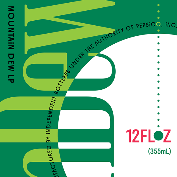
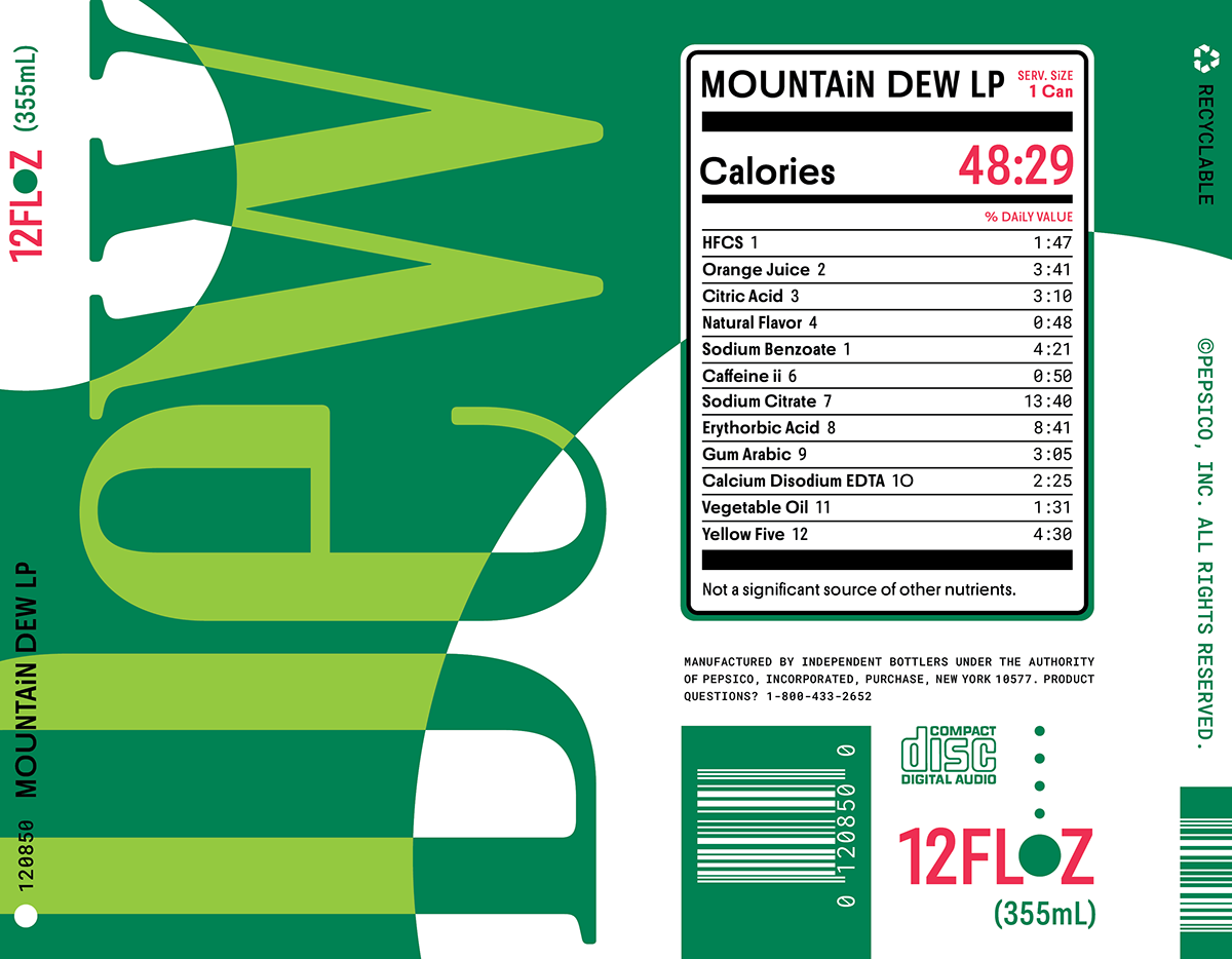
I knew fairly early on that I would use the bubbles in carbonated drinks as a motif, which would more simply manifest as filled or outlined circles. This would also relate to the cylindrical shape of soda cans and the CD contained in the jewel case. The task of finding fonts that would respond to this motif presented little difficulty, though after much experimentation I landed on Vincente (a narrow display font with high contrast and circular terminals) and Roboto Flex (a sans-serif with variable weight and width, among other things) to pair with one another.
I made use of the variability of Roboto Flex extensively to emphasize circular letterforms: characters that were not "circular" by my assessment were set to the lowest width, all of those otherwise being set to the highest (reduced by a subtle amount for lowercase). Roboto Flex would not have been a first choice as the expanded letters are never perfectly "circular" and there are a number of variable fonts on the market that are more strictly geometric in general — but as it was the only freely-accessible option I had to make do.
The colors of each design were informed by the same cans from which my copy was extracted, and admittedly do much of the work to associate these pieces with their respective brands. However, I did make a point to examine the proportions in which the colors are originally used in order to effectively communicate them in my artwork.
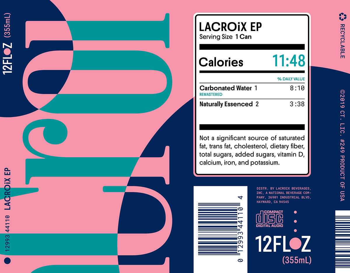
I wouldn't consider this project entirely complete as there are still a number of outstanding typographic issues I need to address, not to mention Roboto Flex will ideally be entirely replaced in the final version. I would also like to apply the same process to other soft drinks to make a more comprehensive set of jewel cases — at which point I would like to physically produce them.
Keep an eye out for new albums from 12FLOZ in the future. What genre can you expect? "Pop rock" would be my best guess. ■
