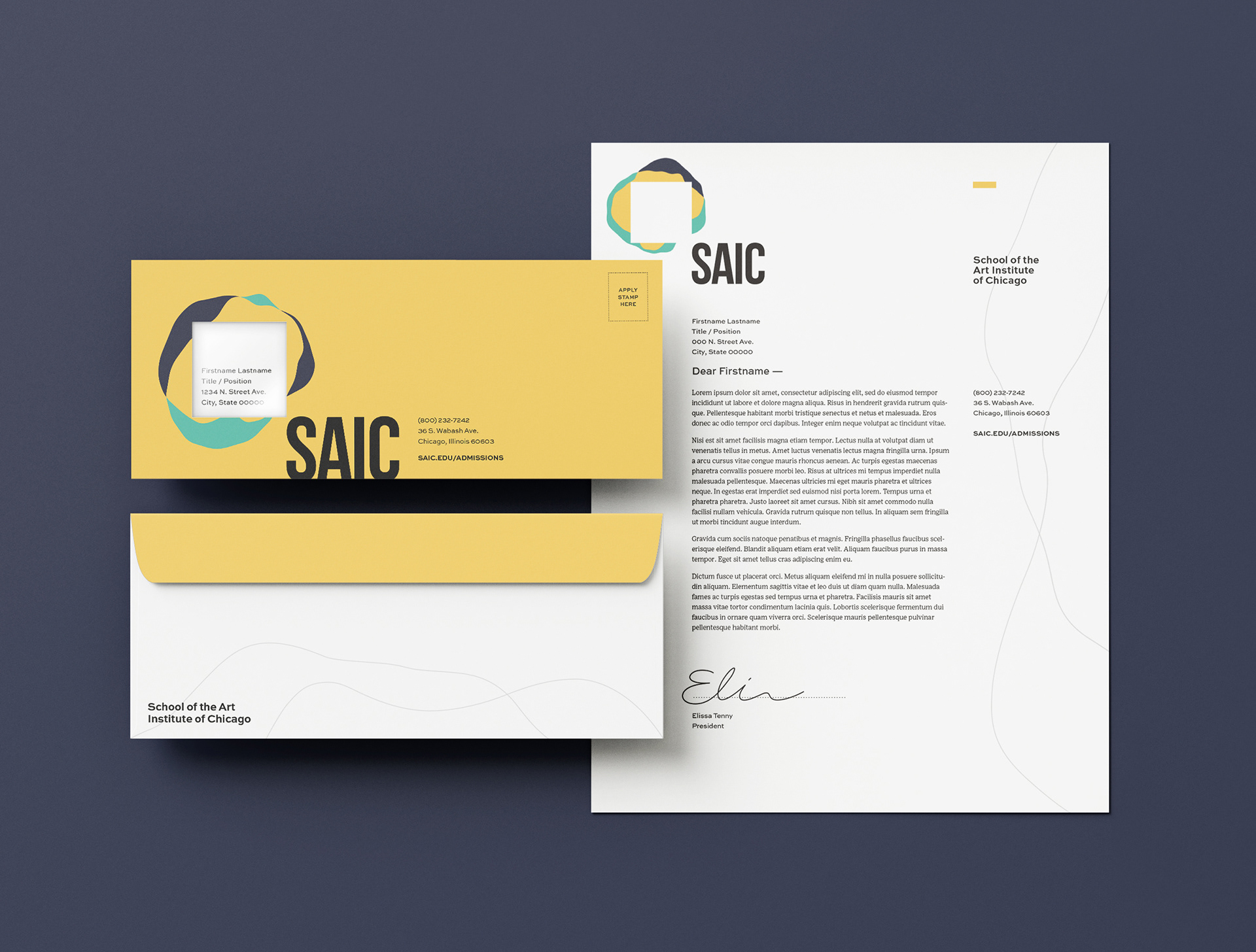
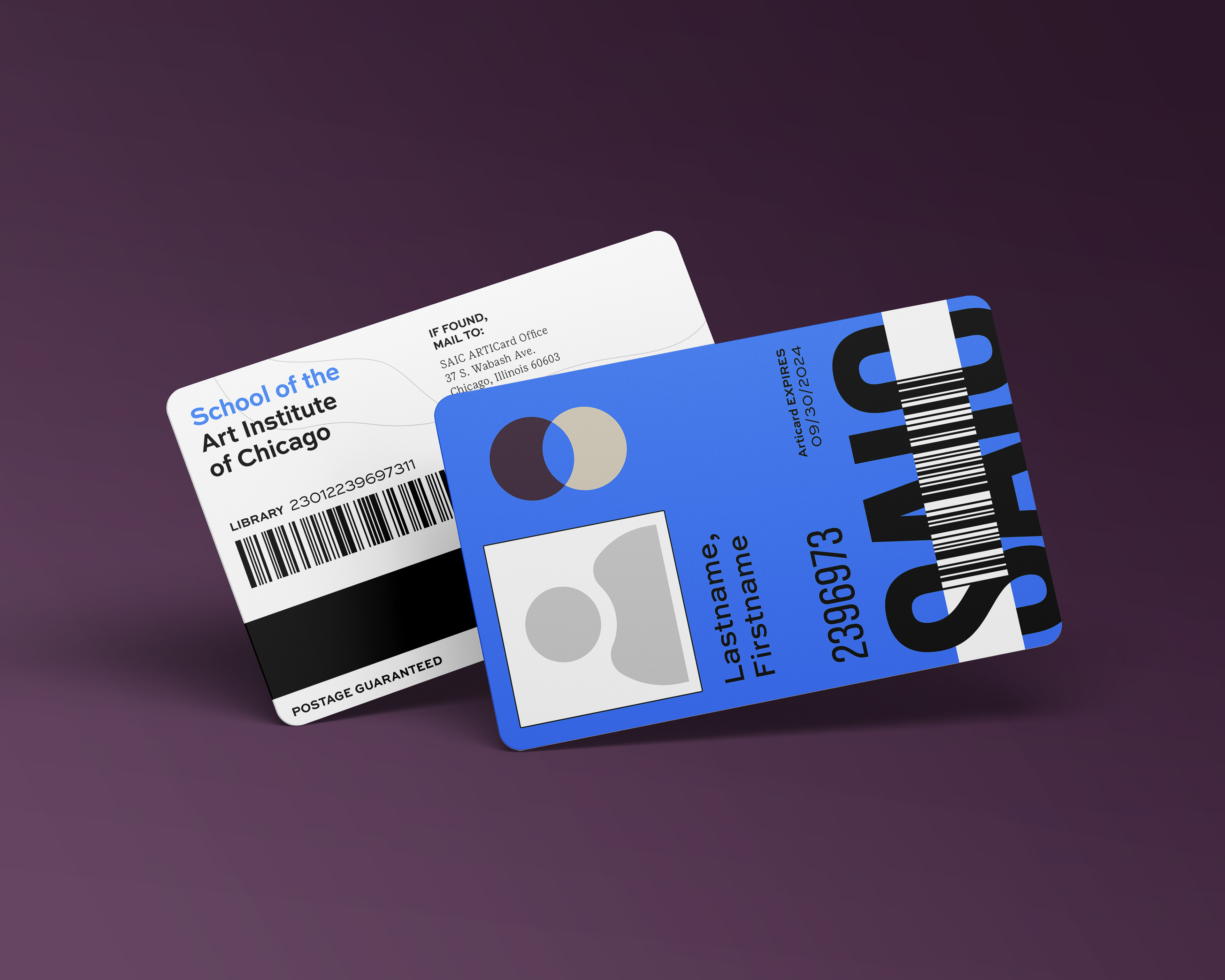
This project was created as coursework for Identity Systems in SAIC's Visual Communication Design department, instructed by designer Robert Petrick.
The third project I was assigned for my Identity Systems course in the Fall of 2021 involved selecting a company or organization to rebrand and completing the three steps — research, design, and application — necessary to do so. A comprehensive "brand guidelines" book resulted from roughly two months of carefully studying and reconsidering the existing identity of the School of the Art Institute of Chicago.
The research phase of this project was to be largely frontloaded according to the provided schedule, though in my case it persisted through week four — partially because I was wary of advancing in the timeline before deciding whether or not to rename the organization in question (see page 14 of brand guidelines).
(brand guidelines, page 4) SAIC's current "black box" comes across as stark and emotionless, failing to communicate anything about a school it should have plenty to say about.
By the time my research was “complete”, my sketches for the cornerstone of the new identity had moved away from static logomarks and into the territory of general concepts that could be applied dynamically. The resulting direction is by no means conventional, though it still requires the core elements of a brand to be defined: logomark, typography, and color.


Pictured above is the variable logo interface I spent a disproportionate amount of time developing using the p5 Javascript library, as well as some of the results obtained by using [SAVE] and [RECORD]. The idea behind the dynamic mark is that all entities within the school – including departments, clubs, and even students – would have an individualized variant of the mark to be paired with their name or title determined by the "seed". Although there are a finite quantity of palettes, the Perlin noise used to generate the overlapping blobs ensures a unique form for every seed.
Retrospectively, I don't think the guidelines I developed for the application of this visual identity are especially practical. Although it is definitely an improvement over SAIC's current identity, it introduces some complexities (especially in regards to the logo and color, seen on pages 20, 24, and 25 of the brand guidelines) that I doubt could be maintained without some sort of dedicated internal brand management.
Regardless, this project allowed for my first significant departure from the static and often type-inspired logomarks I had become so accustomed to designing. Variable and dynamic identities are becoming increasingly relevant as brands continue to push the boundaries of "self-expression" in a market oversaturated with time-based media, and this gave me a taste of what needs to be done to meet those demands. ■


