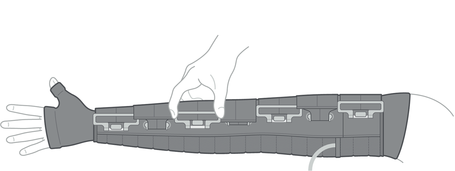
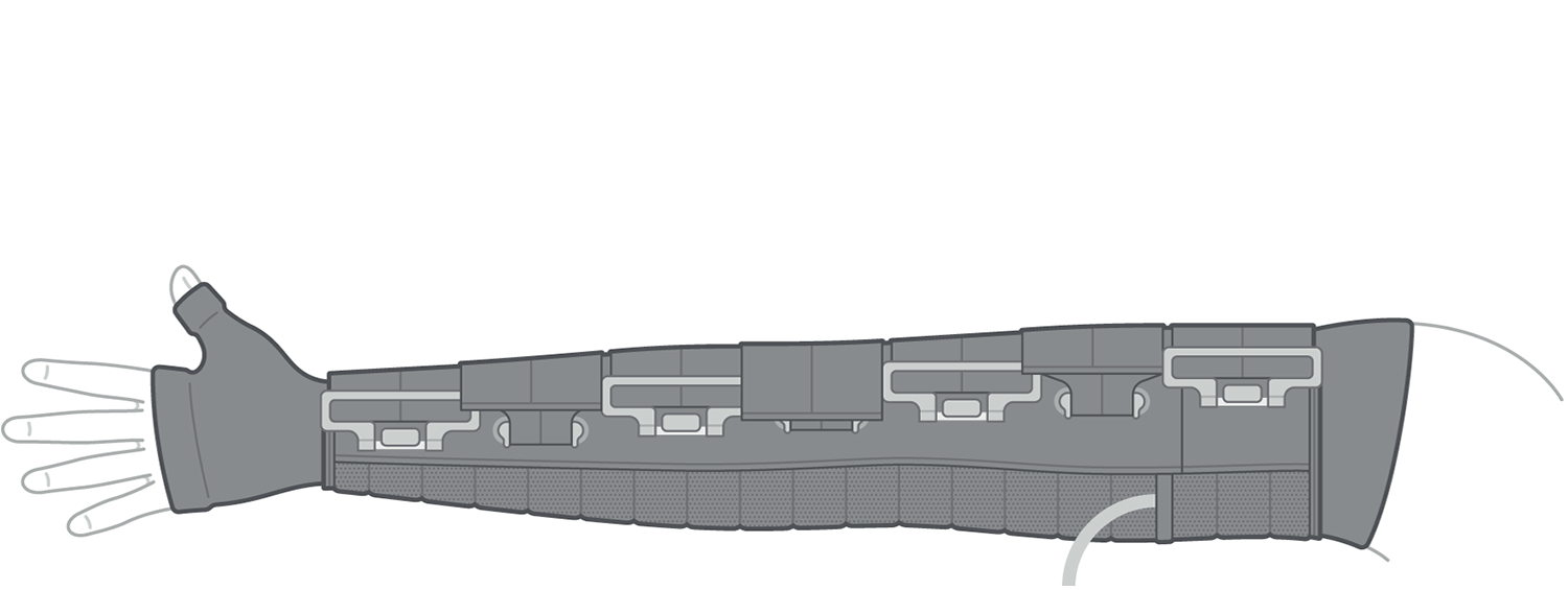
Koya's mission to replace conventional immobilizing treatment for lymphedema with a much more accessible and affordable solution was accompanied by a brand refresh that took place in the summer of 2020. The new treatment in question – a lightweight garment worn on the affected area paired with a small battery pack / controller – required thorough illustration for custom tailoring and usage instruction.
Project Role
Graphic Design Subcontractor
Deliverables
visual identity design, brand guidelines, printed collateral, instructional illustrations, web assets, motion-based explainer video
Koya's new treatment option for lymphedema patients, known as the Dayspring, consists of a skintight liner and gauntlet, an adjustable compression sleeve, and a controller that doubles as a power source for the sleeve. Early versions of the Dayspring were only developed for use on the arm, although options for the calf and full leg have been introduced since the completion of this project.
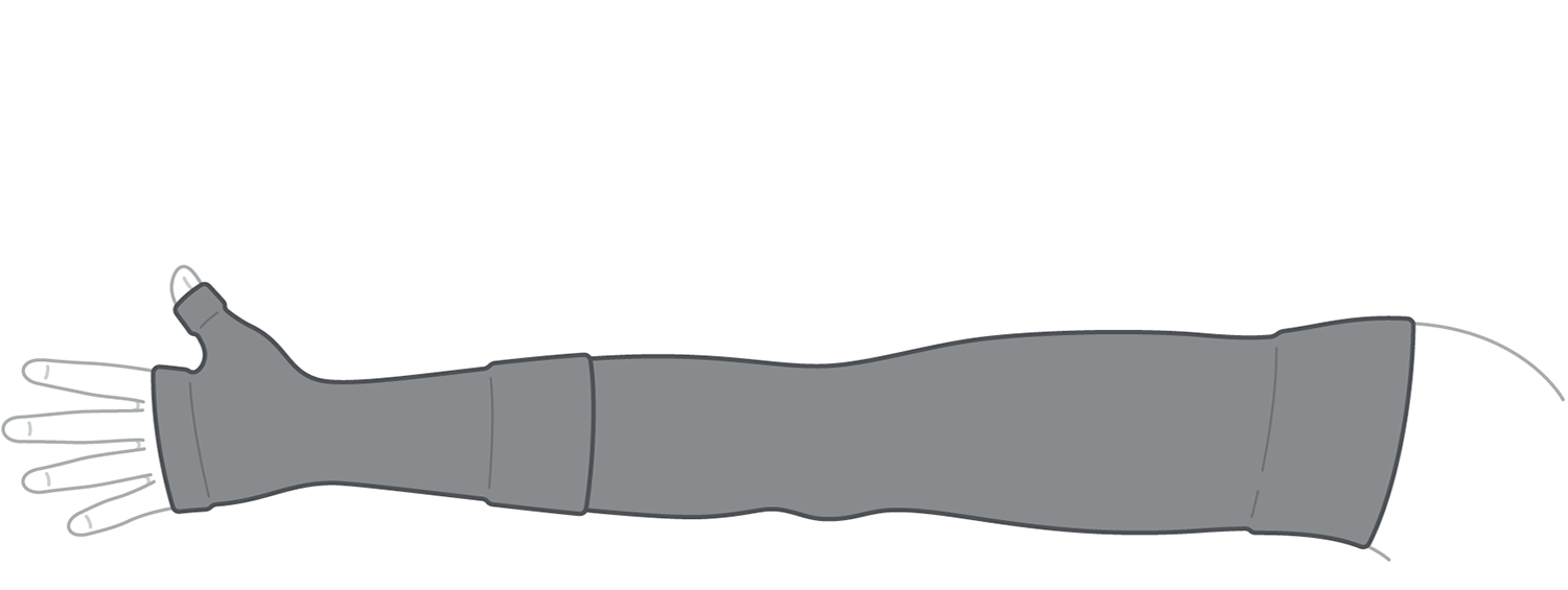
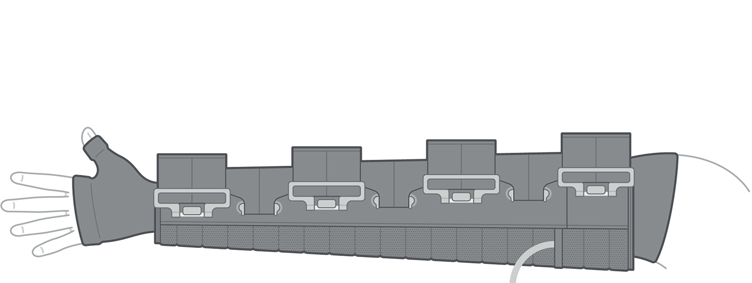
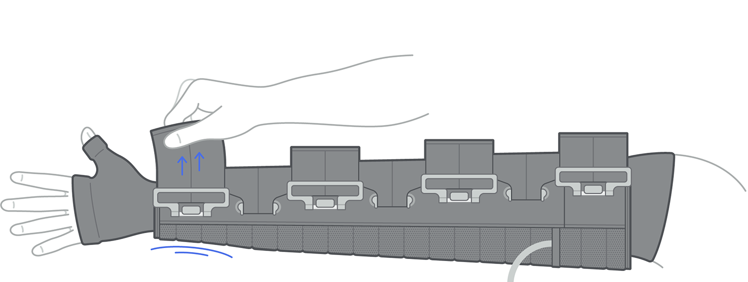
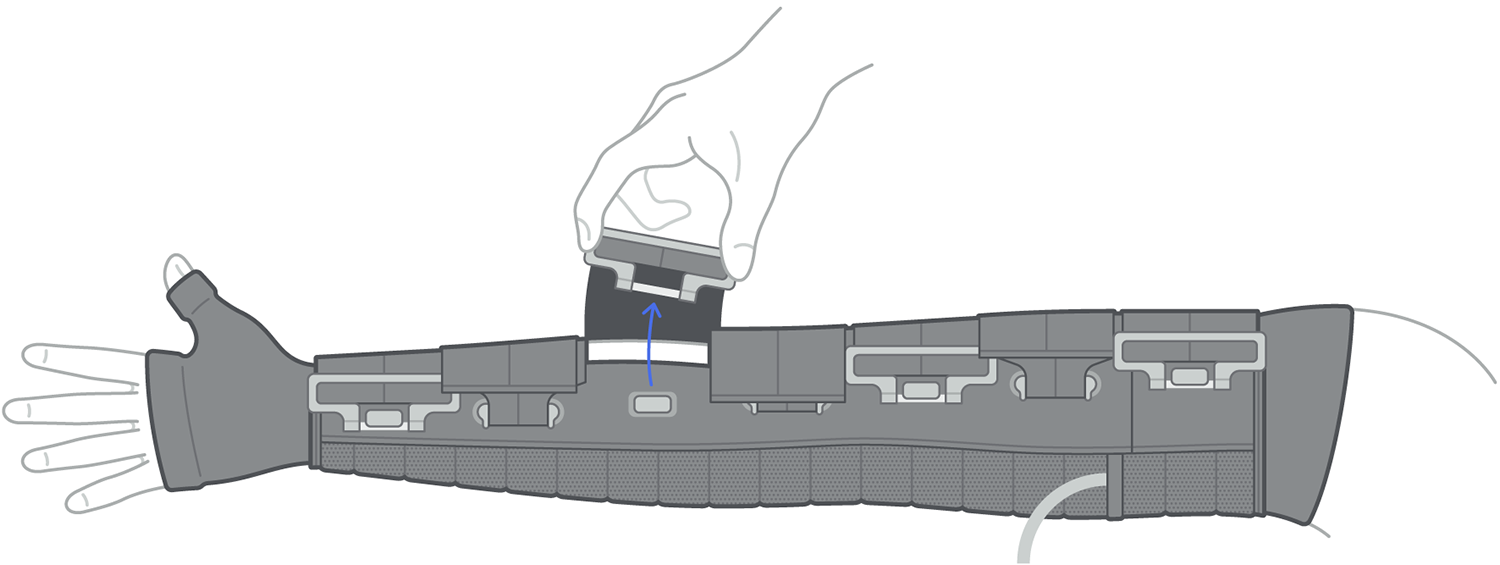
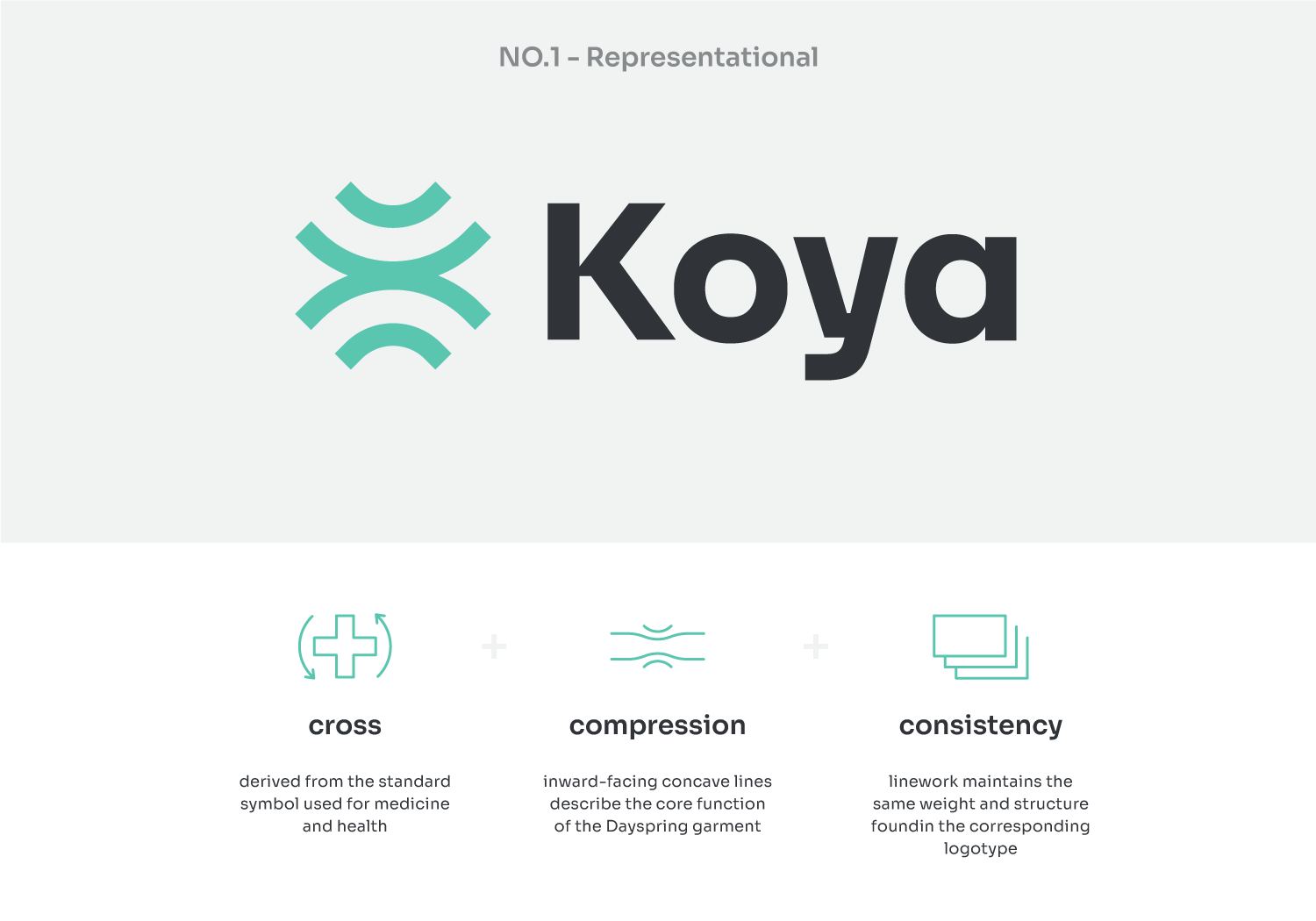
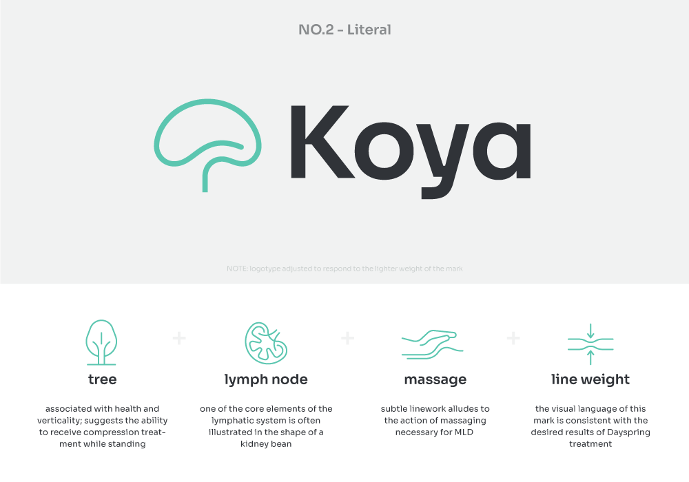
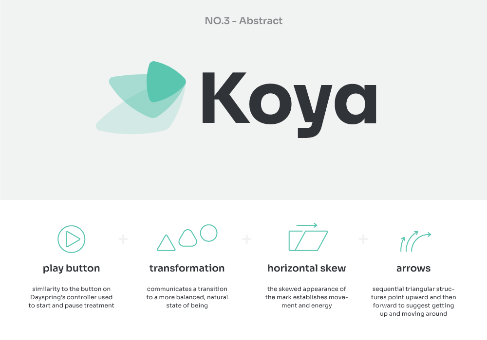
The logo Koya was using when I first started this project was a stylized K that reflected the structure of the mechanical / electronic components inside the Dayspring. There was nothing wrong with it formally, but it failed to communicate anything about the company or the benefits of its flagship product. I presented them with three new logo variants, each with a distinct conceptual underpinning (shown below).
The colors I selected to define the primary palette of Koya's identity are based on the colors used in the garment and controller and various values of green, the color typically used to illustrate the lymphatic system. The latter were adjusted toward blue to appear more sterile and avoid associations with bodily fluids.

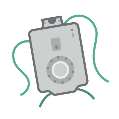


A selection of icons developed for use on the Koya Medical website
Motion-Based Explainer
